DIGITAL DESIGN PROJECTS
F/W Cafe
For F/W, we brought the brand’s hidden main character to the forefront, turning it into a playful voice that connects directly with customers. Seasonal content and monthly photoshoots kept the feed dynamic, while the shift to a friendlier, more engaging tone transformed the brand’s presence — fun and approachable, yet still unmistakably F/W.
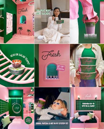
Fresh Superfood Cafe
For this content and photography strategy, we focused on revealing the new Al Liwan branch while highlighting the brand’s playful identity. Inspired by 90s girls and the shows they loved, we designed the socials to feel feminine, pink, and unapologetically fresh — a nostalgic, fun experience that instantly connected with the audience.
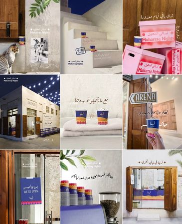
ARENA Cafe
ARENA Cafe
For that month’s content and photography, we focused on ARENA’s presence at the Muharraq Nights event in December. We designed visuals that balanced the cafe’s playful, interactive identity with the event’s theme, the location’s atmosphere, and the winter season’s feel — creating an engaging experience that celebrated ARENA’s presence in a lively, festive context.

Reviive Cafe
Kapsule Wellness
For that month’s content and photography, we highlighted select items for summer, creating a seasonal visual theme that stayed true to Reviive’s brand identity. The result was a cohesive, engaging campaign that brought freshness and vibrancy to the brand while celebrating its signature style.
Kapsule Wellness
Kapsule Wellness
For Kapsule, a boutique wellness and Pilates studio, we developed the full social media foundation from the ground up, defining the theme, aesthetic, and tone for the client to follow. Since the studio wasn’t open yet, we designed all visuals using our AI skills, creating teasers and the official opening post. The result conveys elegance, sophistication, and a refined brand presence.
Art by Adliya Furnishing
Art by Adliya Furnishing
For Art, a furniture brand, we built the full social media foundation from the ground up, defining the theme and aesthetic for the client to follow. We photographed showroom items and used our AI skills to transform them into aspirational, one-of-a-kind visuals. Detailed shots highlighted select furniture pieces, showcasing the brand’s craftsmanship and care for detail.

The Salad Bar
For that month’s content and photography, we highlighted The Salad Bar as an essential part of work life. We captured spontaneous, lifestyle-focused shots at our HQ, showcasing a “day in the life” with the brand. The visuals emphasized freshness, energy, and accessibility, connecting the product directly to the audience’s daily routine.
Bae Ice Cream
For Bae, we focused on announcing the shop’s reopening and comeback, highlighting its signature black ice cream that made it famous. We also developed a summer-themed content direction to showcase the new flavors. The visuals combined nostalgia with freshness, celebrating the brand’s return in a fun and engaging way.
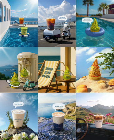
Marina Cafe
Marina Cafe
For Marina Cafe, we aimed to bring the vibrant Marina lifestyle to their Instagram, which was previously missing. We created playful characters to highlight the fun, interactive side of the brand while keeping the visuals aligned with its blue, coastal identity. At the same time, we showcased the food to maintain a full brand experience.
Saham Clothing Brand
Saham Clothing Brand
Saham Clothing Brand
For Saham, we built the full social media foundation from the ground up, defining the theme and aesthetic for the client to follow. The identity blended cultural and historical elements with a modern tone and visuals. Detailed shots highlighted the brand’s craftsmanship and attention to detail. The result positioned Saham as a brand that honors tradition while feeling contemporary and engaging.
Rich Bakery
Saham Clothing Brand
Saham Clothing Brand
For Rich Bakery, we introduced a Pinterest-inspired aesthetic for the brand’s visuals. We photographed and created content that highlighted new items while reflecting this soft, pastel, and aspirational look. The result was a cohesive and visually appealing feed that elevated the brand’s playful and charming identity.
A1 Cafe
Saham Clothing Brand
A1 Cafe
For A1 Cafe, we developed a full social media identity to make the page interactive, youthful, and distinctive. We photographed and created visuals that brought this vision to life, designing a unique approach that highlighted both the matcha and their whole cakes. The result was a vibrant and engaging feed that gave the brand a clear and memorable personality.
Terra Tea
For Terra Tea, we guided the brand identity process and translated it into the socials and photography we created. The launch was executed in a sophisticated, Pinterest-inspired style — clean, elegant, and focused on introducing the brand along with its unique tea flavors. The result was a cohesive, a presence that positioned Terra Tea as a desirable brand.
Chunk
For Chunk, we established the brand’s foundation and defined its social media identity, then focused on photography that highlighted their tempting cookies. We created visuals that positioned the brand as friendly, playful, and true to its colors and personality. The result was an engaging, appetizing feed that brought the brand to life.